
2025年07月12日
【本番5日前からやるべきスピーキング集中対策】
試験直前の5日間、何をすべきか明確ですか?
限られた時間を最大限に活かすために、戦略的な“集中対策”が重要です。
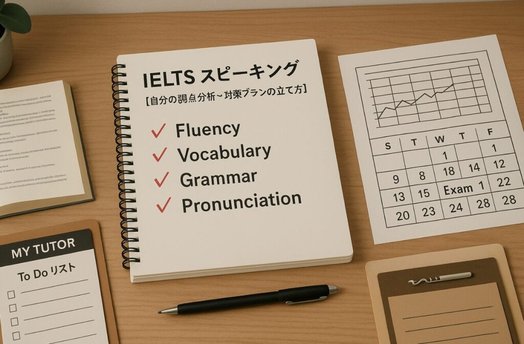
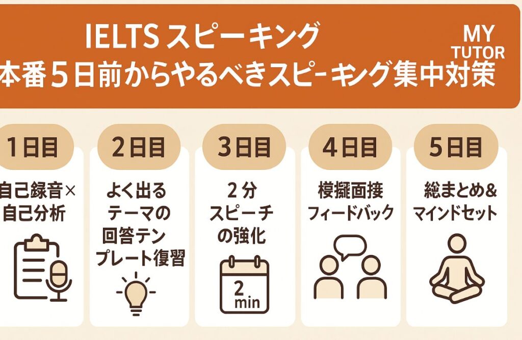
🔍 1日目:自己録音×自己分析
- タスク:Part 1・2・3を各1セット録音し、聞き返して改善点を洗い出す
- チェック項目:
✔ 発音が聞き取りやすいか?
✔ つなぎ言葉を使えているか?
✔ 言いたいことが整理されているか? - 目的:本番に備えて、自分の癖や弱点を把握する
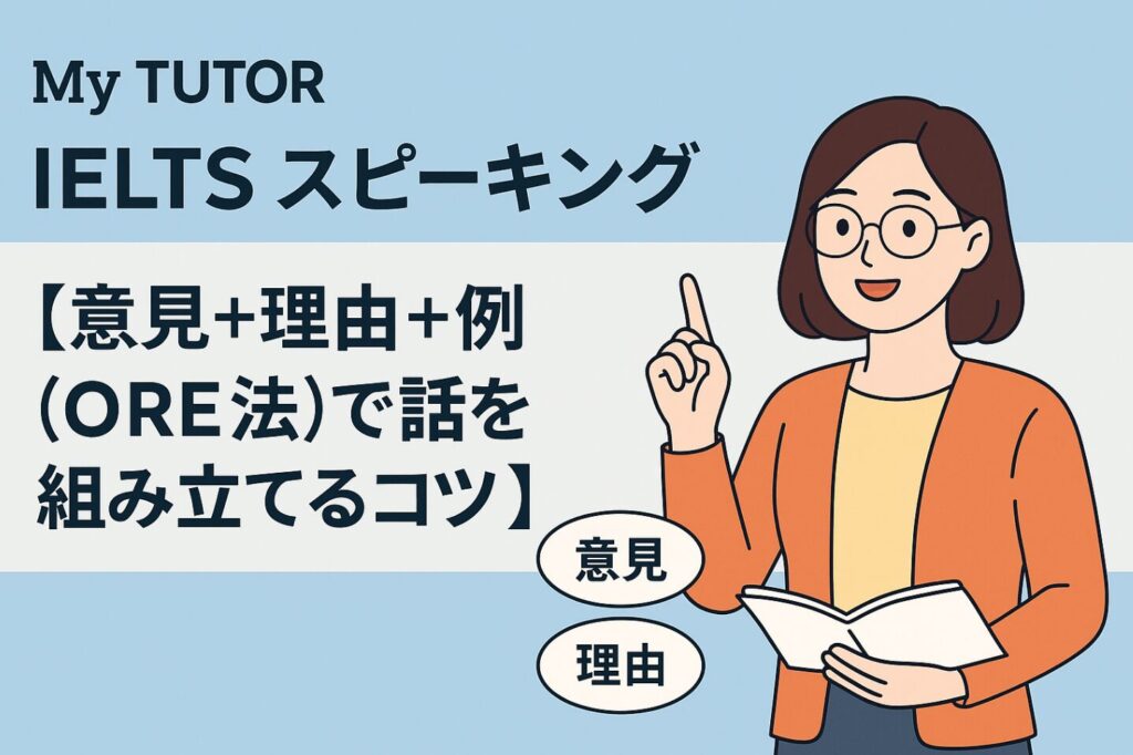
✍️ 2日目:よく出るテーマの回答テンプレート復習
- 重点分野:教育・環境・テクノロジー・旅行など
- アクション:各テーマに対して「導入→理由→具体例→結論」の構成で答える練習
- ポイント:「I think…」「The main reason is…」「For example…」など、使い慣れた表現を再確認
🎤 3日目:2分スピーチの強化(Part 2対策)
- 準備:過去問・予想問題を使用
- やること:
① 1分間でメモを取る練習
② 2分間、止まらずに話す練習 - コツ:時間配分を意識し、「起承転結」を意識した話し方を身につける
👥 4日目:模擬面接 & フィードバック
- 方法:オンラインレッスン or 友人・先生に協力してもらう
- ゴール:本番と同じ流れで体験し、質問に柔軟に対応する力を強化
- 改善点:録音して聞き直し、言い回しやテンポを調整
🧘♂️ 5日目:総まとめ & マインドセット調整
- 最終チェック:メモの取り方、つなぎ表現、語彙の確認
- やること:本番と同じ時間帯に練習し、生活リズムを整える
- 心構え:「完璧」を求めず、「伝える姿勢」を大切に
- リマインダー:「間違えてもOK」「内容より伝える姿勢が大事」
✅ まとめ
本番直前の5日間は、「自分のスピーキング力を最大限引き出す準備期間」です。
計画的に練習→振り返り→修正を繰り返せば、スコアアップは十分に可能です。
焦らず、ひとつずつ丁寧に取り組んで、試験当日は自信を持って臨みましょう!